Search This Blog

Tuesday, November 25, 2014

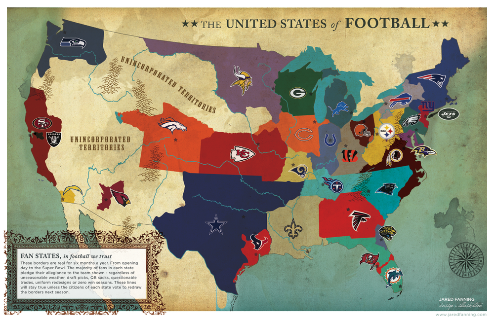
Map Find - Bivariate

I found a good one. This one is about Sasquatch. It's easy to read and understand. My main takeaway is that Sasquatch has evolved to live in many different areas, but hates most of the great plains. Joshua Stevens made it. He is a cartographer and PhD student at PennState. This was an inset map of a bigger dot density map of similar look/feel that shows the spatial distribution of sightings much better.

Tuesday, November 18, 2014

Found 2 Geodetic markers


Found 2 marker. I have no idea why the images are rotated. I used NOAA's Geodetic Mark locator map website to find them. I walked directly to both of them. I looked for two others in the area with no luck.

Lab 10

Lab 10 ended better than it started. Trying to figure out what to do with 2 sets of data took longer than than it needed. I ended up just picking something on going with it. I think the map is easy to look at and the proportional symbol/choropleth match works well. I used a complimentary color wheel to pick blue and orange. The legend was something I tooled with for a while. There might be a best way to lay that out, but i tried several and they all looked equally awkward. In any event, it's done.

Tuesday, November 11, 2014

Lab 9

Lab 9 started well, but then I got going with the dots. I'm not sure if the size came out right. The colors and background were easy and I was satisfied with the text, but the dot size was questionable. I think 400 people per dot was over kill because doesn't represent density as accurately as if i were to use less people per dot. In any event, it's done. Next Lab.

Tuesday, November 4, 2014

Map Find - Dot Density

I picked this map because it's election day. If you are an intern working for a candidate you should be looking at maps like this instead of bothering me as I try to get in and out of the grocery store without being accosted. This map shows you where the voter turnout is in Virginia. As an intern, you should be accosting the people in central and southwestern Virginia. We clearly don't have a problem with voter turnout in NOVA, or Richmond, or Hampton Roads. Each dot represents 30 vote casts and I see a tons of single dots in other places than here in Fairfax.  The Bull Elephant posted this map, but you can thank the Center for Politics in Charlottesville for doing the plotting.

Map Find - Isopleth

I took this map from the Virginia Places website. It's run by the GMU geography professor that teaches the Geography of Virginia course. I picked it because it makes me think of how much field work had to be done to make this map at all accurate.  The map says it is generalized, but this still takes some time to process. It's clean and not a complete mess that other geology maps tend to be.

Monday, November 3, 2014

Mapping Conspiracy Theories in Virginia

My final project will be a map of government and military conspiracy theories in Virginia. Even though I work in the Intelligence community, I still have a general interest in some of the unique missions being carried out on some of the military installations I visit. I also think the location of these installations is almost as interesting as their mission. The locations will be the main focus of the map.
 The audience is mostly me, but I think the conspiracy theorists websites I have been data mining from will appreciate my effort in plotting the location they are so curious about. The locations are going to be what makes this map interesting to look at. They are often right on the other side of the fence from major roads and neighborhoods, while some are deep in the woods or on the top of a mountain.
The content for this map will be derived from multiple sources including conspiracy theorists blogs, .gov and .mil websites, and my own experience with some of the sites in question. Reading the conspiracy blogs turned up suspicious sites I didn’t even know about.  The map will show how saturated Virginia is with secretive military and civilian installations. I will plot their location along with a photo or satellite image of the location along with it’s suspected mission. The base map will be from the ESRI ArcMap library.
This map requires a fair amount of combing through conspiracy theorists blogs to find out what locations they are theorizing about.  When I find a post with a location I might be able to use, I turn to Google search and Google Earth to see it and to find the public release statement…if there is one. In most cases, the military discloses the mission of each instillation and sometimes the blogger refuse to accept the statement published. 
The challenge will be to decide what content to include and what to discard because there are so many locations the conspiracy theorists are questioning. Anyone can be a Imagery Analyst with the free Google Earth application and some of them feel the need to blog about their suspicions. The other challenge will be design. There are not a lot of unclassified examples of government map designs to reference. I made a rough illustrator sketch to brainstorm what I want the map to look like.


Conspiracy Theory Blog Posts


Map Brainstorm


Lab 8

SMERG is bad and this is what came to mind. Probably too dark, and probably not enough contrast, but I like it and thats why it's finished and published. Plotting the lines took almost as much time as making the smoke.  If the fake SERG data is correct, then this is a very accurate map.

Tuesday, October 28, 2014

Lab 7

This is my rendition of Lab 7. I didn't do as bad as the others and my confidence is building. To me it's easy to read and not too much dead space. The scale was tricky because the difference between the smallest and largest numbers was large and so the smallest symbol is almost too small and the largest symbol is almost too big for the county. Next Lab.

Monday, October 27, 2014

Map Find - Proportional Symbol

This is a proportional symbol map i found on a Penn State geography website. I picked it because it looks like something I would do, but it's on a Geography 485 masters level class site. I should not be allowed to judge maps, but I can say this one is about as striped down as you can get. It makes me wonder why they picks to show and attached to a 485 class. I did a google search and found hundreds of examples, none more drab than this.

Lab 6

Lab 6 was easy on layout and content, but difficult on picking colors that print well. I thought the digital copy was pretty good. Everything is legible and there is no banding in the gradient. However when I printed it it looks poor. I tried 3 different shades of green and orange and something about it just looked bad. Over saturated and banding were my biggest problem. I'm over it. Next Lab

Map Find - Color

Found this color map on a image design blog by Michael Doret. Our task was to find a color map. The assignment might of had more to in that that, but I found this one after a quick google search and i decided i was done looking. It gets more interesting the longer you look at it.

Tuesday, October 21, 2014

Map Find 5 - Choropleth

This is the most unique choropleth map I could find. I found it on a political blog by Charles Apple. For the most part I'm politically apathetic, but I liked the raster look and you can still see a warped shape of the US. Political maps are starting to pop up in the news and to me they all look the same. This one actually caught my eye and made me stop and look.

Lab 5


I was not thrilled with the way these turned out. I was not sure what to do with the legend and how to fit all that cash in the empty space, but the color ramp turned out nice and I can see 5 different shades of grey fairly easily. Alaska and Hawaii are where I put them because this looks best to me... no other reason.

Lab 4

Lab 4 gave me fits with the banding. The other difficult part is trying to design something that looks nice when working with the most basic layers. On a good note, I am getting better with illustrator. 6 more labs to go.

Tuesday, September 30, 2014

Map find 4 Campus Map

This is the NYU Campus map in Manhattan. I specifically picked this one out because I have a friend who went to school in NYC and I always wondered what it was like navigating a city to get to class. What I think the designers were going for here is to make the campus look less daunting than is really is. This map makes it look clean and straight forward, and it has names that people that want to go to NYU will recognize like Chelsea, Soho, and Greenwich Village. For an incoming freshman actually navigating this campus, it's probably more like sensory overload.

Map find 3 - Typography

I found this typography map on a blog by James Cheshire. His bio says he teaches in the geography department of University College London. It's a map of London that looks like someone started doodling in class and it turned into a very detailed map. It has a ton of information on it like a historical bit about fish jumping out of the Thames during an earthquake in 1750. You can see hospital signs, neighborhoods, and tourist locations. All the in-between spaces are filled in with text.

Thursday, September 25, 2014

Lab 3

This lab took longer than I would like, but it turned out acceptable to me. The sizing for print and blog post was a hang up and if you get to click happy on the canvas you could easily end up editing a layer you had not intended. In any event I'm done. Moving on.

Wednesday, September 17, 2014

Lab 2

I can be done with Lab 2 now. I could be tweaking, pushing, and pulling forever with this one. It looks right, but it's very difficult to get it exact. There is other homework that needs done so I need to move on


Tuesday, September 9, 2014

Lab 1

Her is my rendition of Lab 1. Looks good as a graphic, but printing is another story. I've burned up enough paper and ink so I'm calling this one done.

Monday, September 8, 2014

Map Find 2 - Projection

In celebration of the NFL season and our lecture on projection I wanted to post this map. It looks like a throwback territories chart from the early Americas. I would say this map was projected using Lambert conformal conic because the border between the United States and Canada has that curve to it. The orientation of the US looks right. It looks like the early maps we used to name the states in elementary school. We were looking at a Lambert conformal conic projected map and didn't know it yet.   This one was posted by sbnation and was created by Jared Fanning.

Thursday, August 28, 2014

Map Find 1

This is a topographic map. The military types in the class will recognize it as a land navigation map. The 4 circles are waypoints already staked out for a student or trainee of the land nav course to find. I like these maps because the features are very accurate and the information proved, like the grid lines and elevation notation, is useful in many ways. A map like this is also great for land navigation because even if you don't have your protractor and compass, you can still use terrain association to find your way. Take note of  the undulation or a surrounding feature like a peak or cliff, or maybe a road or stream is marked. Take these features and see if they are corresponding with what you see on the map. If your lost in the woods, this is the map you want. This map was from a land nav course and you can see how the students did by visiting this link.